
This article was written by Kari Daelke, Area 9 Publications Chair
As much as we love handbell rehearsal, our ultimate goal is to share with others the beautiful music we can create as a group or as an individual ringer. Here are some design tips to help you create a great promotion for a concert you have planned, a fundraising campaign for more handbell “stuff,” or to enhance your music in with some complimentary visuals.
1. Stick to a simple easy-to-read collection of fonts for maximum legibility.
2. Make your design dynamic by applying scale to type, shapes or compositional features that need proportionate emphasis.
3. Respect the space of other elements in your design. Work toward even spacing and avoid overcrowding of shapes, images or text
4. Keep things clean, crisp, and clear. No point in creating something if you cannot read what you created.
5. Contrast is essential – especially for headlines that may need to be easily read from a distance.
6. Choose fonts that reflect the mood/tone you want to set just like flowing eighth notes or marts can change the character of the music we play.
7. The most visually dominant feature in your design should be the most important part of your message. A good graphic design practice is to apply color or scale to your graphic to see how it changes the hierarchy of your elements.
8. Create drama and impact with attention-grabbing graphics. Ensure your colors do not bleed together by choosing hues that contrast against one another.
9. White or “negative” space is your friend. The application of space around your text boxes, images, and other graphic features makes it easier to read and is more likely to attract attention than a cluttered composition.
10. Have Fun!
Technical Bits – Bitmap vs. Vector Graphics
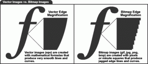
Digital images can usually be divided into two distinct categories. They are either bitmap files or vector graphics.
Bitmap: As a general rule digital pictures and scanned images are bitmap files and are made up of many tiny blocks of color or pixels. These are sometimes called raster images. Bitmap images are resolution dependent. Resolution refers to the number of pixels in an image and is usually stated as dpi (dots per inch) or ppi (pixels per inch). Bitmap images are displayed on your computer screen at screen resolution: approximately 100 ppi. However, when printing bitmaps, your printer needs much more image data than a monitor. To render a bitmap image accurately, the typical printer needs 150-300 ppi.
Vector: Drawings made in illustration software such as Adobe Illustrator or Corel Draw. These programs use mathematical equations and geometric points, lines and shapes to create art that is clean and can be scaled infinitely without any loss of quality or fidelity.
Getting It Printed
1. High-quality images will give the best result.
2. Do you want to have your layout to print from edge to edge? If so, you will need to add “bleed” to your document. When the printer prints the piece, they will print it on oversized paper and the trim the excess so the final desired size. It is recommended that you add 1/8 inch to all sides of the document. (i.e. a letter sized document with bleed will be 8.75 x 11.25). Before printing, crop marks are added to indicate where the trimming needs to occur. This is done because it is virtually impossible to cut a stack of sheets precisely enough to avoid having some paper show at the edge without having some wiggle room. Keep in mind there is always some movement in the paper as it goes through a press and even more if using a digital press/copier.
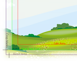
3. Try to allow ¼ inch margin around the edge of your page if your document does not bleed. A traditional printing press needs a “gripper” area to grab the paper to pull it through a press and digital presses/copiers are may be unable to print to the edge of the page.
4. No matter what software you used to create your masterpiece, your print/copy shop is going to prefer a PDF file. When creating the PDF check the settings. They should be set to “print quality” with high-resolution graphics. Make sure your fonts are also embedded.